SWISS FILMS
ux/ui project
An expressive yet functional site to surface the content of SWISS FILMS through a combination of effective art direction, content strategy, and interaction design.
*Please note: A fully completed interactive prototype was not required for this project.
Role
UI/UX design, Art direction, Prototyping, Project Management
Tools
Figma, After Effects
Team
Jocelyn Qiao, Raphie Robles, Peter Huang
Goal
The goal of this project was to explore different design qualities to create an expressive yet functional microsite while using the content found on SWISS FILMS' existing website. This was a four week long project for a senior level user experience design course at Simon Fraser University.
*Their official website has now been updated since then, we worked with the content provided at that time in October 2021.
Exploration
At the initial stage of this project, my team and I created potential mockups separately to explore our creativity in expressive art direction. As the focus of our client is on promoting Swiss made films and creators, we wanted to highlight the cinematography by presenting their work as full bleed previews upon hover.

Ideation
In order to move forward with our expressive microsite, we discussed how to frame the project differently and remove parts that did not feel engaging. We scratched out the traditional interactions and layouts of websites we were incorporating and started with a blank canvas. We began to brainstorm some original concepts related to our client, aiming to expand on them to further evoke emotional responses from audiences.
New Concept
- Have interactions that allude to techniques used in film/cinema that will then inform our design decisions and make for a content-driven site
- Nostalgia/romanticism about watching a film in a cinema setting (in this age of watching films at home, cinema and film festivals ground people and bring them together)
Prototype
Based on our new concept, I combined four elements related to film in our final prototype by taking inspiration from cameras and film strips as our precedents.
-
The bar on the left presents the date of when the film was produced which can be either clicked on or navigated through by scrolling to show the correlated film. This “timeline” navigation bar is inspired by the zoom focus ring on cameras.
-
The video snippets on the landing page move in and out as you scroll vertically. This was designed to imitate the feeling of looking through a film reel.
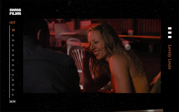
-
While experimenting with the layout, I added small squares on the right side of the page to mimic the film perforations on the sides of film strips. I felt that this made the layout look too busy and decided to simplify it. The remaining three film perforations reminded me of a hamburger menu icon, which allowed us to seamlessly use it as a functional design element as well.
-
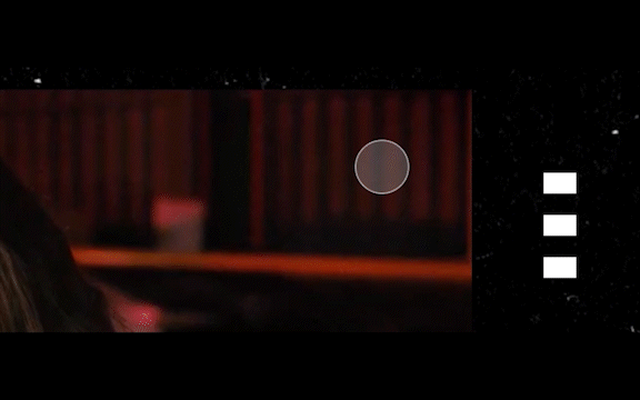
I designed the loading animation screen to resemble a film leader countdown to notify the users who have clicked into a film title that a film snippet will be playing shortly.

Conclusion
We were able to identify which areas needed improvement and iterate, resulting in a much better project that had elements that were praised by the teaching team. Although we lacked the time to create a fully functional microsite, it has been a project that really pushed me to think outside of the box and opened me up to more unconventional user interface design.